Peak–End Rule — Make your product unforgettable
Big idea: users don’t remember every screen. They remember the most intense moment (peak) and how it ends. Nail those two and people will love your product — even if the middle is ordinary.
1) What it means
- People recall one peak (best or worst moment) and the ending.
- The middle screens are mostly forgotten.
- So: focus design energy on peaks and endings.
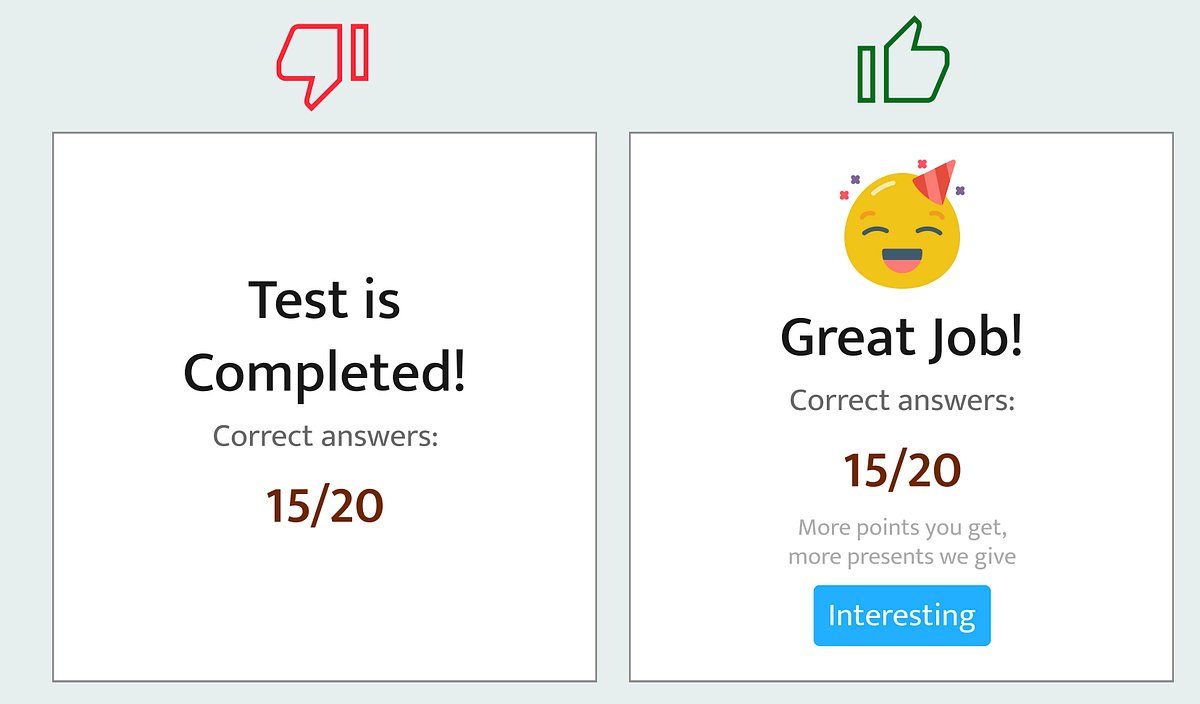
2) Quick examples
- Good: Duolingo — peak: fun animations for correct answers; end: cheerful progress/celebration.
- Good: Uber — peak: live driver tracking turns anxiety into anticipation; end: arrival notification.
- Bad: Banking apps — stressful flow + boring “Transaction complete” screen.
- Bad: Support chat — long wait (negative peak) + abrupt “case closed” (forgettable end).
- Bad: Ticketing sites — surprise fees (rage peak) + plain confirmation (forgettable end).
3) Step-by-step: apply it now
- Map the journey. List the user flow and highlight the top 3 emotional moments (positive or negative).
- Design the peak.
- If positive: amplify delight (micro-animations, sound, confetti, clear progress).
- If negative: reduce intensity or reframe it (show progress, give control, add empathy).
- Design the ending. Turn final screens into a memorable close: clear summary, celebration, next steps, rewards.
- Ship & measure. Track short-term signals (completion rate, NPS, quick surveys) to confirm the memory effect.
- Iterate. Small peaks/end changes → big perception lift.
4) Quick checklist
- Identify the worst or most intense moment. Can you reduce it?
- Add one small celebratory element to the final screen.
- Remove any surprise fees or abrupt “done” messages.
TL;DR
People forget the middle. They remember how you made them feel. Stop polishing every pixel equally — obsess over the peaks and the endings. Those are what stick.